Physical Address
304 North Cardinal St.
Dorchester Center, MA 02124
Physical Address
304 North Cardinal St.
Dorchester Center, MA 02124

Color Psychology in Web Design is the science of how colors influence human emotions, perceptions, and decision-making. Colors do much more than make a website look attractive—they shape first impressions, build trust, guide user actions, and even affect purchasing decisions. Choosing the right color palette can enhance user experience, strengthen brand identity, increase engagement, and ultimately improve conversion rates.
Whether you’re designing a business website, portfolio, eCommerce store, or landing page, understanding color psychology helps you create visually appealing interfaces that connect with your target audience and encourage meaningful interactions.
In this complete guide, you’ll learn everything about Color Psychology in Web Design, including the meaning of different colors, how they influence user behavior, practical applications for websites, and the best practices for choosing an effective website color palette.
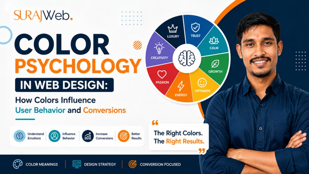
Color psychology is the study of how different colors influence human emotions, perceptions, and behaviors.
When visitors land on your website, their brain processes colors before reading your content. This means your website’s color scheme creates the first impression within seconds.
Different colors trigger different emotional responses:
The right colors encourage users to stay longer and take action.
Choosing the right colors helps:
Research shows that people often form their first impression of a product or website within seconds, and color plays a significant role in that perception.
Blue creates confidence and makes visitors feel safe.
Red grabs attention immediately and encourages quick decisions.
Green creates relaxation and trust while representing growth.
Yellow attracts attention but should be used sparingly.
Purple gives a premium and sophisticated appearance.
Orange encourages action without the aggression of red.
Black creates a premium feel when combined with minimal design.
White improves readability and provides breathing room in layouts.
| Industry | Recommended Colors |
| Healthcare | Blue, Green, White |
| Technology | Blue, Gray, White |
| Education | Blue, Green |
| Finance | Blue, Green |
| Food | Red, Orange, Yellow |
| Luxury | Black, Gold, White |
| Fashion | Black, White, Purple |
| Travel | Blue, Green |
| Fitness | Orange, Red |
| Real Estate | Blue, Gray |
Uses different shades of one color.
Example:
Advantages:
Uses neighboring colors on the color wheel.
Example:
Creates harmony and smooth transitions.
Uses opposite colors.
Example:
Excellent for CTA buttons and contrast.
Uses three evenly spaced colors.
Example:
Offers a vibrant and balanced appearance.
A well-designed website isn’t just about choosing attractive colors—it’s about using them strategically. Color hierarchy helps organize visual elements, guide users’ attention, and create a consistent brand experience. By assigning specific roles to different colors, you can make your website more intuitive, professional, and visually appealing.
Below is a standard color hierarchy followed by many successful websites.
The Primary Color is the dominant color of your brand. It represents your company’s identity and is the color visitors associate with your business. This color should appear consistently throughout your website to strengthen brand recognition.
A strong primary color creates a memorable first impression and establishes trust. It becomes the visual identity of your brand and helps users instantly recognize your website.
Example:
A technology company may use Blue to communicate trust and professionalism, while a fitness brand might use Orange or Red to convey energy and motivation.
The Secondary Color complements the primary color and adds variety without overpowering the design. It supports the primary color by highlighting less important elements and creating visual balance.
Using a secondary color prevents the design from looking repetitive while maintaining consistency. It helps organize content into different sections, making the interface easier to scan and navigate.
Example:
If your primary color is dark blue, a lighter blue or teal can serve as an effective secondary color.
The Accent Color is used sparingly to attract attention to the most important interactive elements. Since it contrasts with the primary and secondary colors, it naturally draws the user’s eye.
Accent colors guide users toward actions you want them to take, such as clicking a button, signing up for a newsletter, or making a purchase. Overusing accent colors reduces their effectiveness, so they should be reserved for high-priority elements.
Example:
A website with blue branding may use Orange or Yellow as an accent color to make CTA buttons stand out.
Neutral colors provide the foundation of your website. They create visual breathing room, improve readability, and allow the primary and accent colors to stand out.
Neutral colors improve readability, reduce visual clutter, and create a clean, professional layout. They also enhance accessibility by providing sufficient contrast between text and background.
Imagine a web design agency with the following palette:
| Color Role | Example Color | Usage |
| Primary | #023047 | Logo, headings, navigation, primary buttons |
| Secondary | #219EBC | Icons, cards, highlights, feature sections |
| Accent | #FFB703 | CTA buttons, important links, promotional banners |
| Neutral | #FFFFFF, #F8F9FA, #333333 | Backgrounds, text, borders, layout sections |
This hierarchy creates a visually balanced interface where users immediately recognize the brand, understand content structure, and naturally focus on key actions.
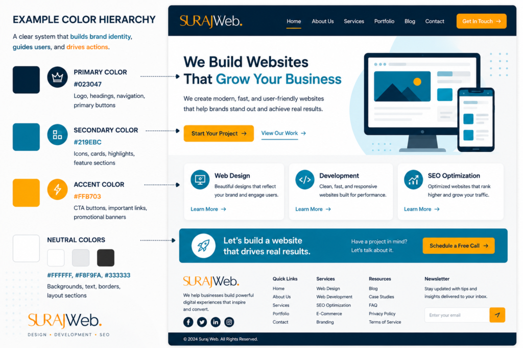
A thoughtful color hierarchy not only enhances the visual appeal of your website but also improves usability, reinforces branding, and guides users toward meaningful interactions.
Call-to-action buttons should stand out.
Popular choices:
Good CTA examples:
✔ Start Free Trial
✔ Buy Now
✔ Contact Us
✔ Get Started
The button should contrast strongly with the page background.
Poor contrast hurts readability.
Good example:
Black text on white background.
Bad example:
Gray text on light gray background.
High contrast improves accessibility and user experience.
Recommended:
Purpose:
Professional and trustworthy.
Recommended:
Purpose:
Highlight creative work.
Recommended:
Purpose:
Increase purchases.
Recommended:
Minimal colors with a strong accent for CTA buttons.
Recommended:
Purpose:
Safety and trust.
Choosing the right colors is essential for creating a professional, user-friendly website. However, many designers make common mistakes that negatively affect usability, branding, and conversions. Avoiding these mistakes can significantly improve your website’s visual appeal and user experience.
One of the most common web design mistakes is using too many different colors throughout a website. While it may seem creative, an excessive number of colors can make your design look cluttered, inconsistent, and overwhelming for visitors.
Limit your website to a consistent color palette that includes:
Using 3–5 core colors creates a clean, balanced, and professional design while maintaining visual consistency across all pages.
Color contrast refers to the difference between the foreground (text or icons) and the background. Low contrast makes content difficult to read, especially for users with visual impairments.
❌ Light gray text on a white background
✔ Dark navy text on a white background
Always ensure sufficient contrast between text and backgrounds. High-contrast combinations improve readability, accessibility, and the overall user experience.
Colors are a key part of your brand identity. Choosing colors based only on personal preference or current design trends can create an inconsistent and forgettable brand image.
Choose colors that reflect your brand’s personality and values.
For example:
Maintain the same color palette across your website, logo, social media, and marketing materials to build a strong, recognizable brand.
Bright colors naturally attract attention, but using them excessively can overwhelm users and make the design feel chaotic.
Use bright colors strategically for elements that require immediate attention, such as:
Balance bold colors with neutral backgrounds to create a clean and professional appearance.
Using different colors for similar elements across your website can confuse users and make navigation less intuitive.
If your primary button is blue on one page, it shouldn’t suddenly become green on another page without a clear reason.
Create a consistent design system where:
Consistency helps users quickly understand your interface and improves overall usability.
Selecting the right colors for your website is more than a design decision—it’s a strategic choice that impacts branding, user experience, and conversions. Following these best practices will help you create a visually appealing, consistent, and user-friendly website.
Different audiences perceive and respond to colors in different ways. Factors such as age, culture, industry, and personal preferences can influence how users react to your website’s color scheme.
The right colors help create an emotional connection with your audience and make your brand more relatable.
Before selecting your website colors, identify your target audience and choose a color palette that aligns with their expectations and preferences.
Your website should be a visual extension of your brand. The colors you use should match your logo, brand guidelines, and overall brand personality to create a consistent identity.
Consistent branding helps users recognize your business across your website, social media, advertisements, and other marketing materials.
Use your brand’s primary color as the dominant color throughout the website, and complement it with supporting colors that reinforce your identity.
For example, if your logo uses navy blue and orange, those colors should appear consistently in your navigation, headings, buttons, and key design elements.
Using too many colors can make your website look cluttered and distract visitors from your content. A limited color palette creates a clean, organized, and professional appearance.
A simple and consistent color system improves usability, strengthens branding, and makes your interface easier to navigate.
Your Call-to-Action (CTA) buttons are one of the most important elements on your website. Even small changes in button color can significantly influence user engagement and conversion rates.
CTA buttons should immediately attract attention without clashing with the rest of your design.
The most effective CTA color depends on your overall design rather than a single “best” color.
An attractive website should also be accessible to everyone, including users with visual impairments or color vision deficiencies. Accessibility ensures that your content is readable and easy to navigate for all visitors.
Poor color choices can make text difficult to read and prevent users from understanding important information.
An accessible color palette not only improves usability but also creates a better experience for every visitor.
These tools can help you generate harmonious palettes and check accessibility.
It is the practice of using colors strategically to influence users’ emotions, perceptions, and actions on a website.
There is no universal “best” color. High-contrast CTA buttons that fit your brand and audience often perform better than simply choosing a specific color.
Blue is widely associated with trust, reliability, and professionalism.
Most websites work well with a palette of 3–5 core colors, including neutral shades.
White backgrounds with contrasting accent colors such as orange or green are commonly used because they keep products in focus and make calls to action stand out.
Color psychology is one of the most powerful tools in web design. The right colors can influence emotions, establish trust, improve usability, and encourage visitors to take meaningful actions. Instead of choosing colors based solely on personal preference, build a thoughtful color system that aligns with your brand, audience, and business goals.
A balanced palette with strong contrast, consistent branding, and accessible design creates websites that are not only visually appealing but also more effective at achieving their objectives.
Let's Build Your Dream Website

Whether you're launching a new business, redesigning your existing website, or looking for a reliable WordPress developer, Suraj Web is here to help. We create fast, responsive, SEO-friendly, and user-focused websites that help businesses grow online. Let's turn your ideas into a professional digital presence that delivers real results.

📞 Call/WhatsApp: +91 77150 50739
🌐 Website: www.surajweb.com
📧 Email: surajgweb@gmail.com

Get Started Today

Have a project in mind? Contact Suraj Web today for a free consultation. We're ready to design and develop a website that reflects your brand, engages your audience, and helps your business succeed.

🚀 Let's build something amazing together!